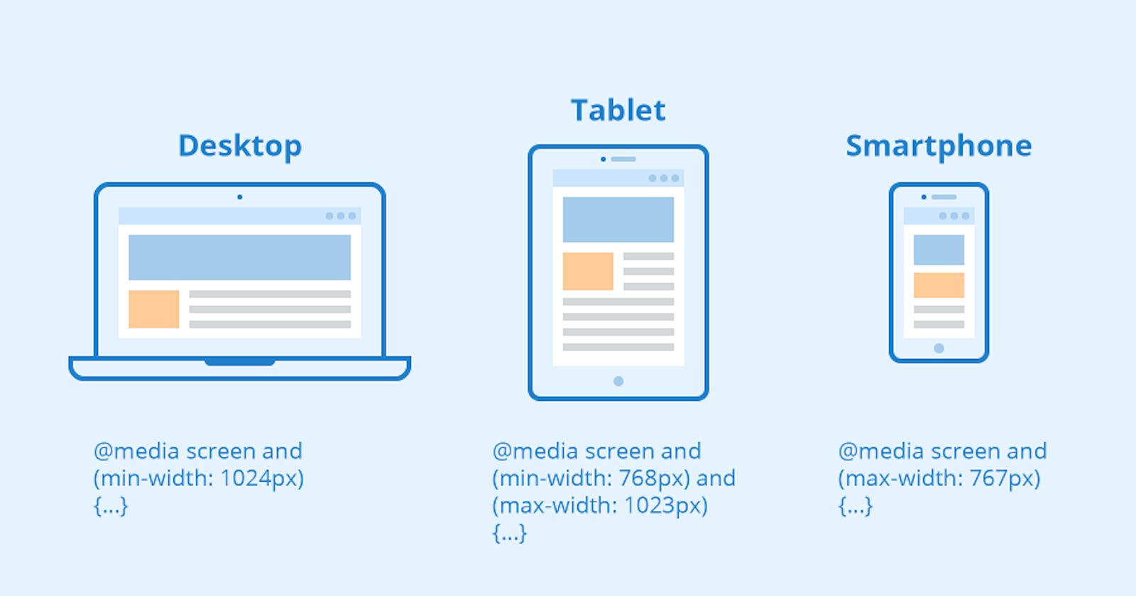
Title: Responsive Web Design with Media Queries: Creating Adaptive User Experiences
Table of contents
No headings in the article.
Introduction: In today's digital landscape, it is essential to design websites that provide a seamless user experience across a wide range of devices and screen sizes. Media queries, a fundamental component of CSS3, empower web developers to create responsive web designs that adapt gracefully to different viewport dimensions. In this article, we will explore the concept of media queries and demonstrate their usage with example codes to help you create adaptive and visually appealing websites.
Understanding Media Queries: Media queries allow you to apply CSS rules based on specific conditions, such as screen size, device orientation, resolution, and more. By using media queries, you can target different devices and alter the layout, typography, and other visual aspects of your website accordingly. This enables you to deliver a tailored experience to users on smartphones, tablets, desktops, and other devices.
Example: Mobile-First Approach Let's start with a simple example of a mobile-first approach, where the initial CSS styles are designed for smaller screens and then enhanced for larger screens using media queries.
/* Base styles for mobile screens */
.container {
  width: 100%;
}

.text {
  font-size: 14px;
}

/* Media query for larger screens */
@media screen and (min-width: 768px) {
  .container {
    width: 750px;
  }

  .text {
    font-size: 16px;
  }
}
In this example, the .container element has a width of 100% and the .text element has a font size of 14 pixels by default, suitable for mobile screens. Using a media query with the @media rule, we target screens with a minimum width of 768 pixels. Within the media query block, we override the styles for .container and .text to adjust their sizes for larger screens.
Example: Device Orientation Media queries can also be used to adapt the layout based on device orientation, such as portrait or landscape.
/* Base styles for portrait orientation */
.container {
  flex-direction: column;
}

/* Media query for landscape orientation */
@media screen and (orientation: landscape) {
  .container {
    flex-direction: row;
  }
}
In this example, the .container element is styled with a column layout for portrait orientation. When the device switches to landscape orientation, the media query is triggered, and the layout is adjusted to a row orientation. This ensures optimal use of screen space and improves the user experience.
Example: Resolution and Density Media queries can also consider the resolution and pixel density of the device to provide high-quality visuals or tailored styles.
/* Base styles for regular resolution */
.image {
  width: 300px;
  height: 200px;
}

/* Media query for high-resolution displays */
@media screen and (min-resolution: 2dppx) {
  .image {
    width: 600px;
    height: 400px;
  }
}
In this example, the .image element has a width and height of 300 pixels by default. When the device has a minimum resolution of 2 dots per pixel (dppx), indicating a high-resolution display, the media query is triggered. Inside the media query block, we update the dimensions of the .image element to provide sharper and more detailed imagery.
Conclusion: Media queries play a vital role in responsive web design, allowing developers to create adaptive layouts and styles for different devices and screen sizes. By leveraging media queries, you can deliver a consistent user experience across a wide range of devices, from smartphones to desktops. Experiment with various media query conditions, such as screen size, orientation, resolution, and pixel density, to tailor
your website's appearance and optimize usability. With media queries, you can ensure that your website looks and functions beautifully on every device, enhancing user engagement and satisfaction.
