Table of contents
No headings in the article.
When it comes to designing and structuring web pages, the CSS Box Model plays a fundamental role. It forms the foundation of web layout and provides developers with a powerful toolset for positioning and styling content. Understanding the CSS Box Model is essential for creating visually appealing and responsive websites. In this article, we will explore the concept of the CSS Box Model, its components, and how it influences the layout of web pages, accompanied by examples to illustrate its practical application.
What is the CSS Box Model?
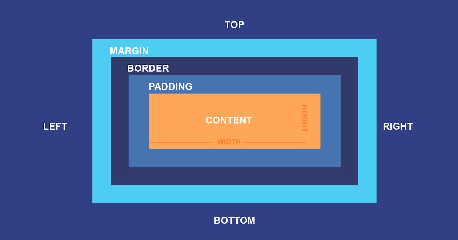
The CSS Box Model is a conceptual model that describes how HTML elements are structured and displayed on a web page. Each element is treated as a rectangular box, and this model defines the properties and behaviors of that box. The box is comprised of four main components: content, padding, border, and margin.
- Content: The content area represents the actual space occupied by the element's content, such as text, images, or other HTML elements. Its size is determined by the width and height properties set in CSS. For instance, consider the following CSS rule:
.box {
  width: 200px;
  height: 100px;
}
In this example, the content area of the element with the class "box" would be 200 pixels wide and 100 pixels high.
- Padding: Padding is the space between the content area and the element's border. It provides breathing room for the content, preventing it from touching the edges of the border. Padding can be set using the
paddingproperty in CSS, which allows you to specify the padding size for each side of the box individually or as a single value for all sides. For example:
.box {
  padding: 20px;
}
This rule applies 20 pixels of padding on all four sides of the element, effectively expanding the size of the box.
- Border: The border is the line that surrounds the content and padding of an element. It provides a visible boundary for the element. Borders can be customized in terms of color, style, and width. Here's an example:
.box {
  border: 1px solid #000;
}
This rule sets a solid black border with a thickness of 1 pixel around the element.
- Margin: The margin is the space outside the element's border. It creates a gap between adjacent elements. Like padding, margins can be specified individually for each side or as a single value for all sides. For instance:
.box {
  margin: 10px;
}
This rule applies a margin of 10 pixels to all four sides of the element, creating space around it.
Understanding the Box Model's Impact on Layouts:
The CSS Box Model has a significant impact on the layout of web pages. By manipulating the properties of content, padding, border, and margin, developers can control the spacing, alignment, and overall structure of elements.
For example, let's say we have two elements, "box1" and "box2," with the following CSS rules:
.box1 {
  width: 200px;
  height: 100px;
  padding: 20px;
  border: 1px solid #000;
  margin: 10px;
}

.box2 {
  width: 300px;
  height: 150px;
  padding: 10px;
  border: 2px dashed #f00;
  margin: 20px;
}
In this scenario, box1 would have a width of 200 pixels plus 20 pixels of padding on each side, resulting in a total width of 260 pixels. Taking into account the 1-pixel border on each side and the 10 pixels of margin, the actual space occupied by box1 would be 282 pixels wide and 142 pixels high.
Similarly, box2 would have a width of 300 pixels plus 10 pixels of padding on each side, resulting in a total width of 320 pixels. The 2-pixel dashed red border and 20 pixels of margin would further increase the dimensions of box2.
By adjusting the box model properties, developers can create various layouts, control the spacing between elements, and achieve the desired visual effects.
Conclusion:
The CSS Box Model is a vital concept for web developers, enabling them to design flexible and visually appealing web pages. By understanding how the content, padding, border, and margin components work together, developers can effectively control the layout and spacing of elements. Mastery of the CSS Box Model empowers developers to create responsive designs, optimize space utilization, and enhance the overall user experience.
